Helping Paws - Website UI Redesign
UX / UI Design Project Case Study
Overview
Helping Paws is a great organization with the goal of improving the lives of people with disabilities as well as veterans and first responders with PTSD by helping them find service dogs. Unfortunately, their website looks outdated and doesn't meet the accessibility requirements that are especially important for an organization that works with people who might require extra affordances when navigating a website.
Problem
The Helping Paws website did not look professional and had many accessibility issues. The navigation doesn’t have proper contrast and is too small to use on mobile. There’s a lack of clarity to the navigation as well.
Solution
Update the website’s navigation interface, give the site a professional look, and added options to change the text size and contrast.
Tools Used
Figma
Miro
Illustrator
Photoshop
Google Office
Role
UX Researcher
UX Designer
UI Designer
Timeline
Two weeks of research and ideation
One week of prototype design
One week of visual design

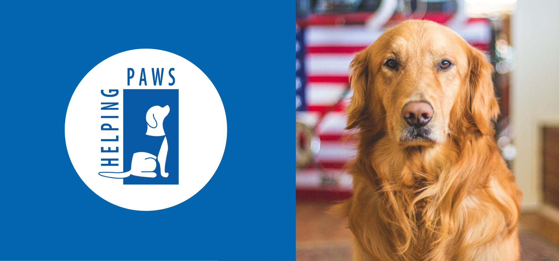
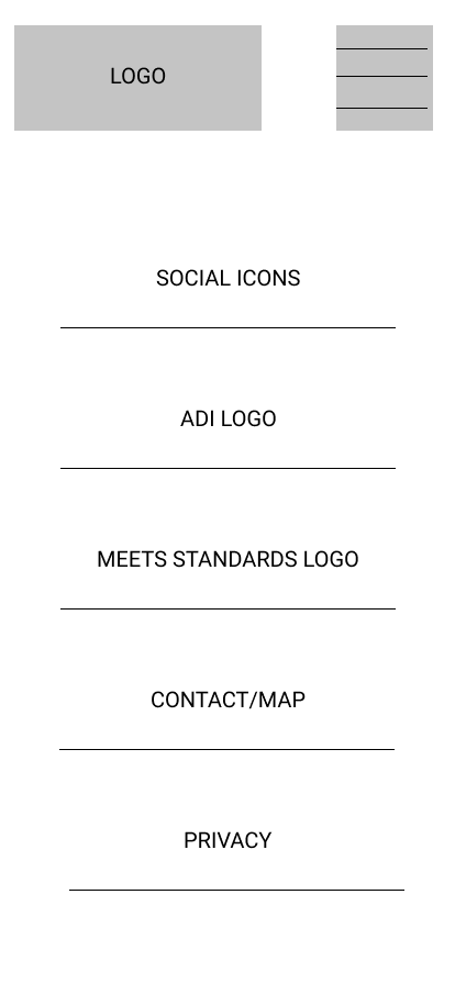
Actual Helping Paws Website
This is what the site looked like when we started this project
PHASE 1: Research & Analysis
Heuristic Evaluation
Doing a complete analysis of the site helped us break down the pages into their individual components and get a better idea of the thought process behind the design. This analysis would provide a guide for our research.
Top bar navigation with arrows indicating a dropdown menu.
Donate text doesn’t contrast with the button’s background.
Social media iconography in an odd spot / not stylized to match the rest of the website.
Could have a CTA button.
Cards could use subheadings to provide more descriptions of what they link to.
Text is within an image. Should be HTML text.
Affiliated organization images are not links.
Competitor Analysis
We looked at three different websites with similar goals including the parent organization of Helping Paws.
Another organization that helps connect people with service dogs
Wide assortment of resources, information, and images
Accessibility toggle
Direct CTA buttons

A place to adopt dogs
Navigation transitions
Good ‘chunking’ of information
A worldwide coalition of not-for-profit programs that train and place assistance dogs
Navigation Stron
Good Contrasting Colors
Clean Fonts/Alignment

An animal farm where kids with disabilities can go to visit animals
Strong Imagery
Navigation Hierarchy
Cursor change
Interviews
We created a research plan to identify what people would need in a service dog website. We conducted interviews with six different people with varying levels of experience with service dogs.
Sample Questions
What features would you prefer to see right away on the website?
What are some things you might find on a site that would make you question its trustworthiness?
For what reasons would you not be able to navigate a website?
Key Insight
More than anything, this quote from one of our interviews really helped inform the next steps of our device project:
“My dad, who has a severe disability because of a stroke...he would need really large and obvious type. He would need really obvious buttons and an email thing maybe that, like, pops up because I don't know if he would have the cognitive ability to type an email. Maybe just even like a phone number. ‘I'm interested call me. My name is Jack.’ Okay. That's what he could do.”
Affinity Diagram
We took our insights from the interviews and sorted them with similar insights to determine which areas required the most focus.
Persona
We created a persona to help us empathize and establish specific needs that we can focus on addressing. Sarah Schoeder is the type of person who wants to be independent and could benefit from a service dog, but doesn’t really know where to begin looking for one.

PHASE 2: Definition
User Insight
Sarah needs a company/website that gives her easier accessibility to navigate quality information in regards to adopting a support animal, so that she can adopt a dog further her independence and quality of living.
Problem Statement
We believe improving the accessibility components, navigation, and content on the helping paws website for people with physical disabilities and PTSD will achieve more independence and higher quality of life, while simultaneously generating new clients for the helping paws company.
UX Hypothesis
We believe Helping Paws will receive more donations and have an increase in the number of people seeking their services if users with disabilities and PTSD have an improved experience when using their website and are able to quickly find what they need. We intend to improve the user's experience when using Helping Paws through the implementation of a more sleek design to inspire trust in addition to options that will make the site more accessible to those with vision impairments.
PHASE 3: Ideation
Feature Prioritization Matrix
We used Miro to facilitate brainstorming and ideation. We used the “I Like, I Wish, What If” method to attempt to generate some ideas. Once we had those ideas together we looked at how difficult each idea would be to implement.
Features to focus on for this project
Accessibility pop-up with text enlargement option
Voice command
Improved visibility
Button enlargement
Improved navigation/visuals
Make the site easier to navigate
Connect external links to accreditation images
Make sure all buttons have proper contrast
Future opportunities
Voice search
Survey to access user’s needs
Augmented reality to see how large a dog would be
Storyboard
To better tell Sarah’s story and how the new Helping Paws website would help her we created a storyboard showing her journey.
Helping Paws Storyboard
PHASE 4: Prototyping
Navigation Redesign
To redesign the navigation, we had four main goals:
Remove Duplicate Pages
Make the design more consistent
Add responsive feedback to navigation items
Make the site look more aesthetically pleasing and professional
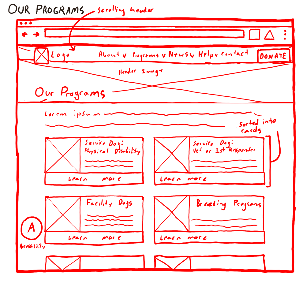
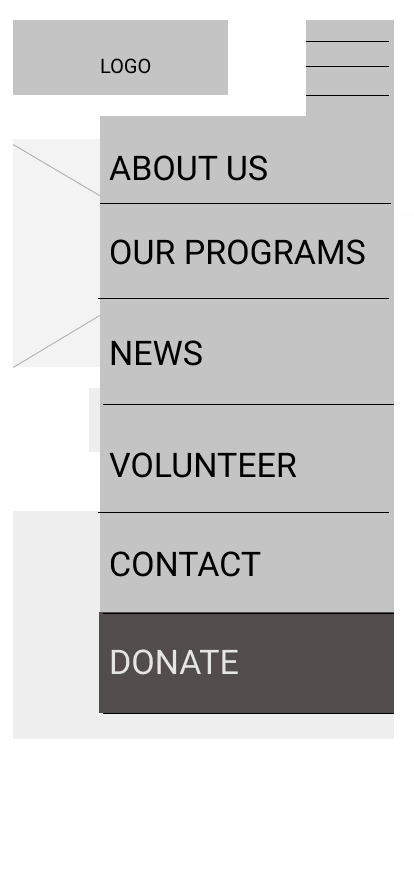
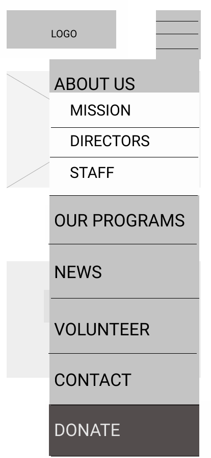
Sitemap
We went through two iterations of the site map. The first version had three tiers to the navigation. For some reason, we thought it would be a good idea to have the only third-tier menus located in the ‘Our Programs’ tab while the rest of the sub-menus only had secondary pages. After we received some feedback on this decision, we decided to make ‘Service Dogs’ and ‘Breeding & Training’ main tabs and promote the tertiary pages to secondary pages. If all of this is confusing, you can just look at the images below to see the difference between our first and second versions.
We also changed ‘Breeding & Training’ to ‘Development & Training’ because we felt listing ‘breeding’ in the sub nav underneath a tab that already says ‘breeding’ would be confusing.
Sketches
Some of our initial ideas for how the site should look.


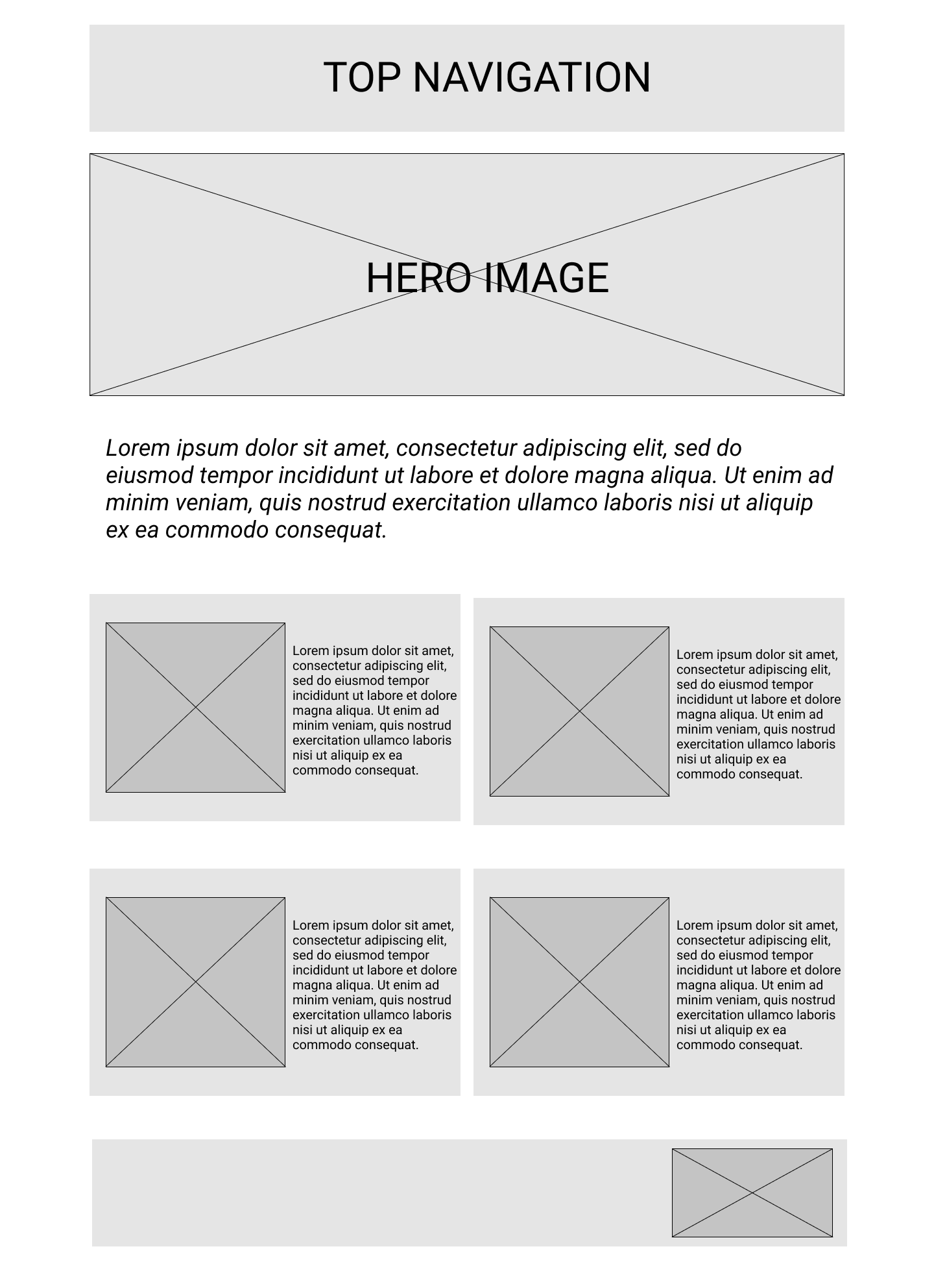
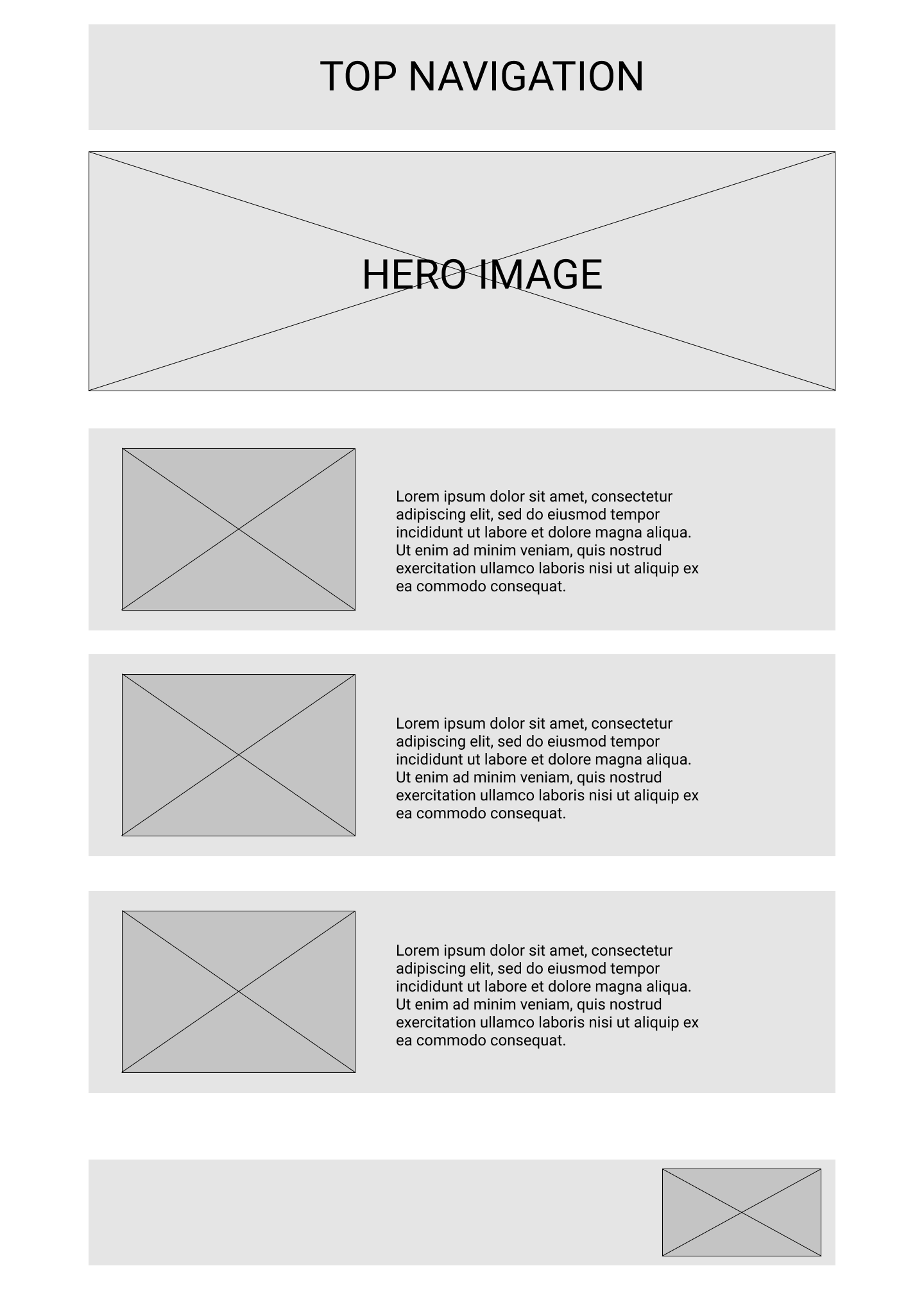
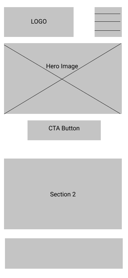
Lo Fi Wireframes
Desktop
Mobile
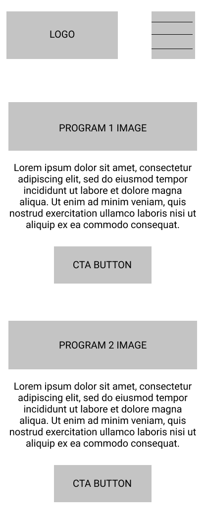
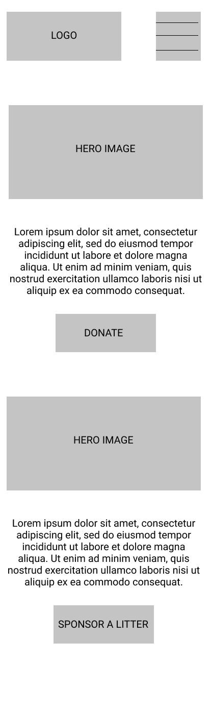
Mid Fidelity Desktop Wireframes
UI Style Guide
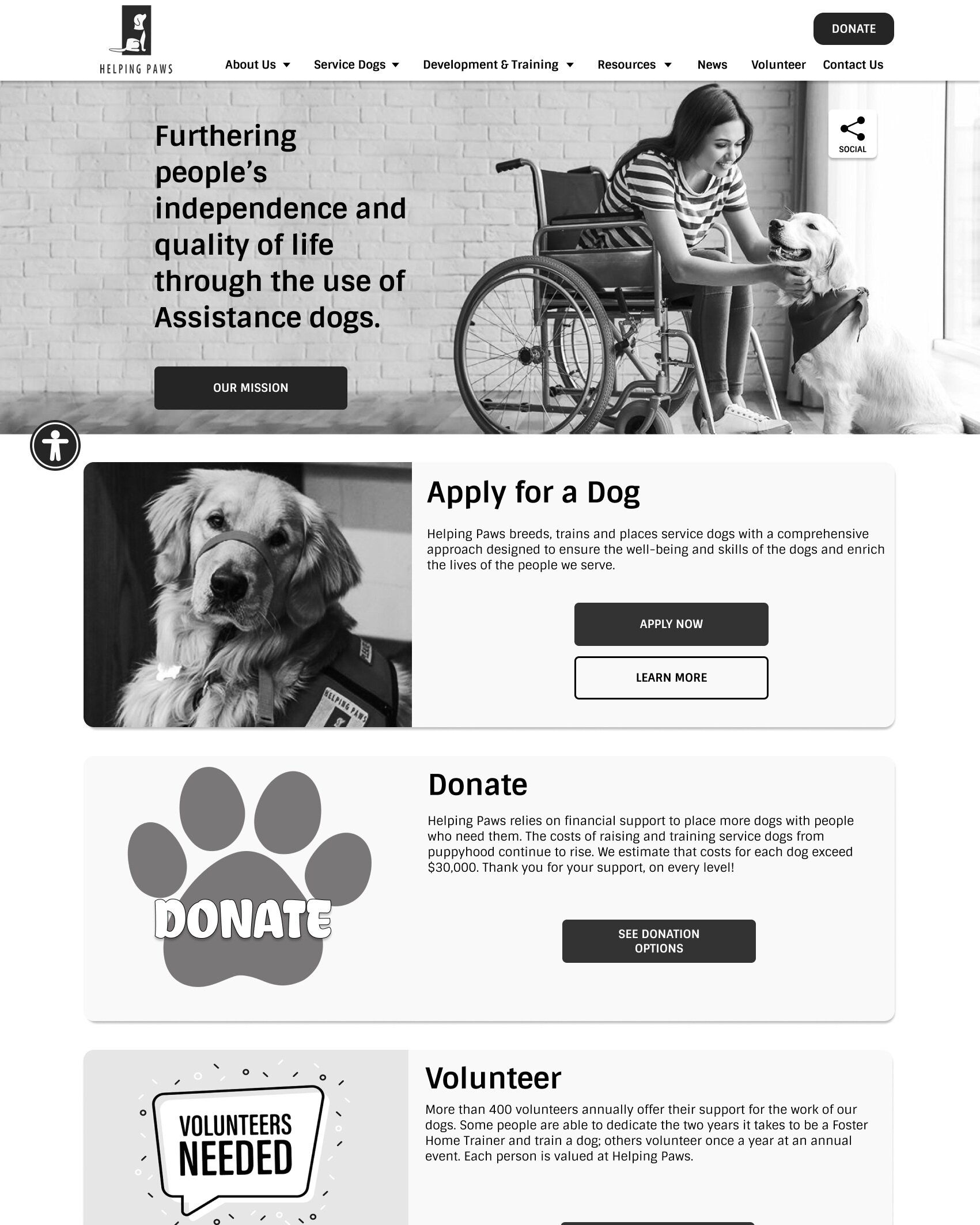
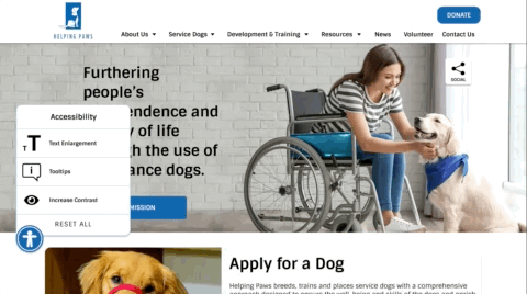
Accessibility Toggle
The Accessibility Toggle button allows the user to enlarge the text, change the whole site to black and white, and also turn on tooltips captions to better explain images. These images can be turned on in any combination.
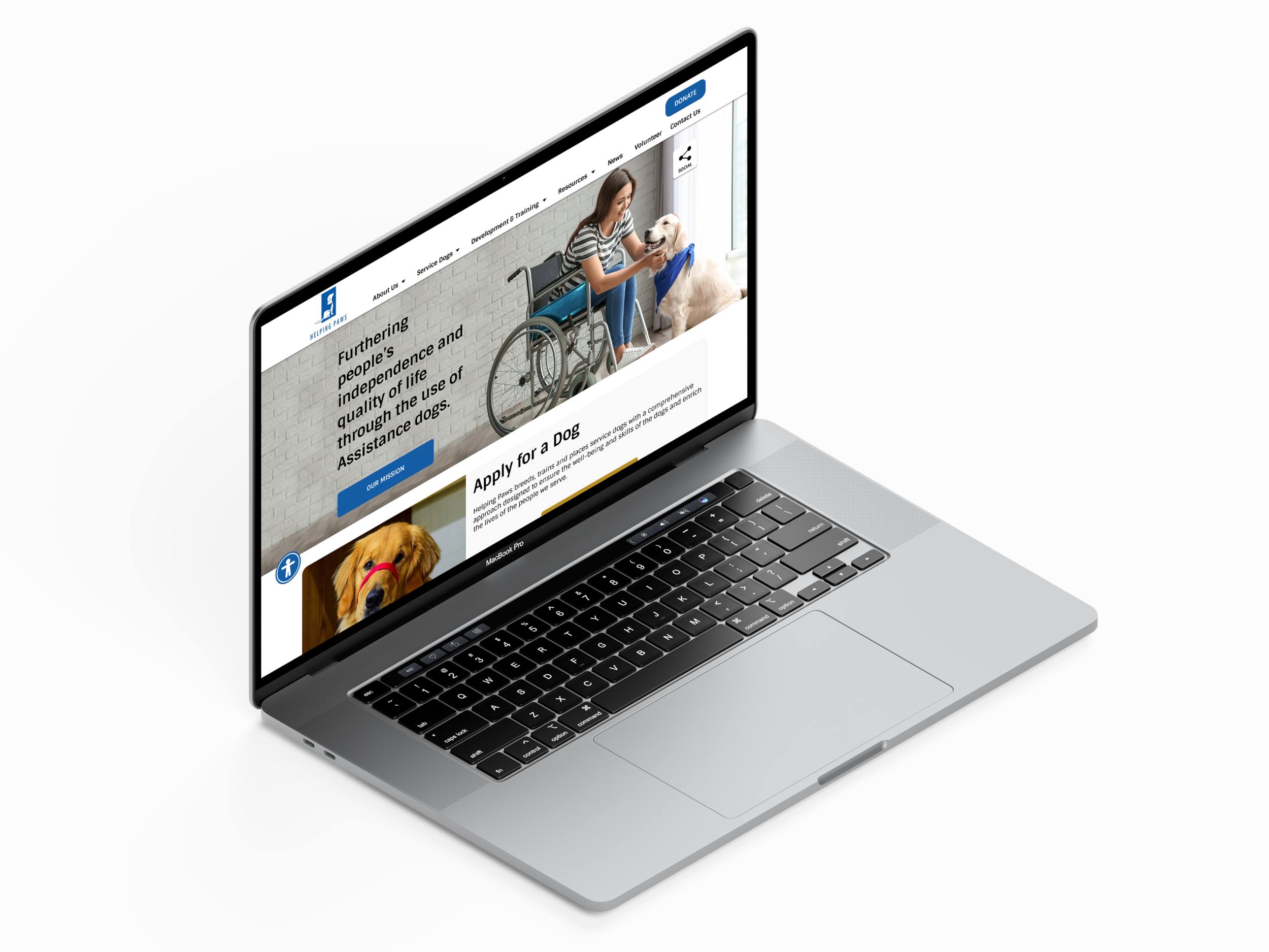
Default View
This is what the site looks like when it loads initially
High Contrast Mode
The entire site changes to black and white

Enlarged Text
All of the text enlarges to help those who may have vision impairment

Tooltips Mode
Tooltips appear when hovering over images
Demonstration
Here’s a .gif version of the site’s accessibility navigation button being used. I would have liked to make this gif larger, but file size restrictions limited how large it could be.
Figma Prototype
Here is the full prototype version that you can try out for yourself.

PHASE 5: User Testing + Outcomes
Iterations Based on Testing
Between the medium-fidelity and hi-fi prototypes, we completed a few different tests to verify the designs. We made several changes based on these designs. Mostly we wanted to make sure the social icons were distinct and prominent enough and we wanted the navigation to be easily understood. I wasn’t 100% sure that having the social icons in two places was a good idea, but our user research made it clear that prominent social media was a big factor in how users see an organization. One other minor change was recoloring the accessibility button to make it stand out more.
PHASE 6: Conclusion + Future Opportunities
We accomplished a lot with this project. I’m really happy with how the UI looks. It would be possible to make something more modern and cutting-edge, but I think that over-designing an interface for aesthetic reasons and not for accessibility would only detract from the purpose of the site. By focusing on legibility, accessibility, and enabling the user to control their experience I believe we added a great deal of value to the site.
We got a lot of positive feedback on this project, however, we did have some valid criticism regarding our persona. Based on who we interviewed, we should have based on goals less on a user with disabilities and perhaps more on someone providing assistance to a person interested in the services of Helping Paws. This was a key learning moment for me that I would consider on future projects.
Next Steps
Some iterations we feel like we could make moving forward
Make accessibility feature more noticeable
Voice functionality
User tests on actual Helping Paws clients
Feedback from the Helping Paws organization
Thank You for Reading
More Case Studies

Avalanche
Mobile Travel Application

Forest Service
Website UI Redesign