AVALANCHE - Mobile Travel App
UX / UI Design Project Case Study

Overview
What if planning a trip was more like making a playlist?
Avalanche is a mobile app that makes travel planning a joy and reduces the stress that data availability can create by making trips available offline. For this project, I navigated through the entire design process from user interviews to a final high fidelity prototype.
Problem
It can be difficult to stay up to date while traveling abroad while trying to avoid high data rates or navigating areas that don’t have good reception.
Solution
A travel planning app that’s straightforward and stays up to date automatically with an interface that feels more like a music app than a calendar.
Tools Used
Figma
Miro
Illustrator
Photoshop
Google Docs
Role
UX Researcher
UX Designer
UI Designer
Timeline
Two weeks of research and ideation
One week of prototype design
One week of visual design
PHASE 1: Research
Proto Persona
We started by building a proto-persona of a user so we could focus on a lot of the same ideas and center our assumptions on one more tangible subject. We collaborated on constructing Peggy Clay - a single New York City fashion designer with a strong desire to travel the world.
User Interviews
We conducted initial research by interview five people about their experiences traveling, using travel applications and websites, and about what features they felt like they were missing in the travel apps they’ve used in the past. We also wanted an idea of how they research the places they’re visiting so they can see if a place is of acceptable quality.
Sample Questions:
How did you book your flight and accommodations last time you traveled?
Do you look at Google, Yelp, or other review websites to get a better idea of the quality of food and other establishments when traveling?
Do you ever find yourself experiencing a language barrier and how do you navigate the problem?
Interview Transcript Selections:
“If I'm doing like a multi-city trip, I will book my trains, my hotels, and everything all in advance and plan nothing in between, just to make sure that like I can go and do whatever while I'm there.”
“It's really about a nice hotel, and then definitely location, like, I'm not going to stay in a Holiday Inn six miles out of the city.”
“...I would go to New York and I would stay in [different] boroughs every time just so I could experience more of New York.”
User Data Analysis
After we completed our interviews, we sorted our insights from each user and then categorized those ideas using an Affinity Diagram. We created specific categories for things such as what users like and what review websites they prefer. We found a lot of our insights were related to planning and that users had some really specific ideas about what applications they prefer.
User Persona
After these ideas were sorted we decided on our persona: Vanessa Shaw, an architect in upstate New York who recently became a partner at an architecture firm and wants to plan a trip overseas as a way of celebrating her accomplishments. Before really mapping out her persona, we created an empathy map to better identify what her needs are.
After we had taken the time to really empathize with Vanessa we were better able to finalize her profile.

Vanessa Shaw - a New York architect eager to see the world, but wary of the stress that comes with traveling abroad

PHASE 2: Definition
User Insight
Vanessa Shaw is a hardworking architect who wants to travel internationally and spend some much-needed time away from the office, her computer, and her workload. She needs a mobile travel application that helps her to plan trips while using as little mobile data as possible in order to minimize screen time and data rates while traveling because it’s important that people like Vanessa minimize stress while traveling and reconnect with the real world beyond their phone.
Problem Statement
Our research has shown that people who travel internationally, like Vanessa Shaw, have had problems avoiding expensive mobile data bills while updating their travel plans on the fly.
Data rates can increase dramatically or service can be completely unavailable while traveling. This can interfere with navigating new areas and keeping travel plans up to date. Our solution should deliver easy-to-use travel planning and the option to minimize data usage for travelers visiting foreign or remote locations.
PHASE 3: Ideation
We used Miro to facilitate brainstorming and ideation. We used a number of methods to figure out possible solutions for our problem.
“I Like, I Wish, What If” Method
Examples of things we Like:
Knowing which restaurants people seem to like the most in a city
When my phone automatically updates (like a Spotify Playlist)
Keeping it simple
Examples of things we Wish:
…could only use a few apps while on vacation
…I could get suggestions based on my preferences
…I could rent a car, book a hotel, and my flight in one place and know I’m getting a great rate
…could see a recommended itinerary that feels personal
Examples of ideas we had when we asked What If?
…my literary could be more like a playlist
…I had all my travel documents in one location
…I could get useful suggestions from a travel app
Feature Prioritization Matrix (How, Now, Wow)
After we had a good assortment of ideas, we asked ourselves which of these Vanessa would view as the most useful and which we think would be the most achievable. Some of the focus features we wanted to create were:
Maps downloading automatically when connected to WiFi
An itinerary building feature that works more like a playlist and wasn’t so rigid
The ability to store travel documents in one place so users wouldn’t need to dig into their emails or have to open more than one app
Value Proposition Statement
It was important to clearly state the value this new product would have for the user. We used a chart to track what value our app could have to the user. We synthesized this into a statement:
”Avalanche is developing an itinerary building travel app with special features for those traveling internationally in order to help people travel the world with a concise plan and not worry about expensive or unavailable data rates.
We're better because we believe travel should an escape from busy schedules and should require less screen time. We want a travel app that feels more like making a playlist in a music app than filling out a calendar. We believe that cell service and affordability shouldn’t inhibit travel.
We're believable because our studies show users want fewer apps when traveling. Our users don’t be restricted by data usage, and they don’t want to worry about getting lost.”
User Scenario
Creating the scenario is where things really start to get interesting for me. I can start to feel the product become real. We created a scenario where Vanessa plans a trip, but also wants to reduce the amount of stress that can happen during foreign travel. We narrowed down this trip to one specific interaction where Vanessa finds a restaurant she wants to visit later. She adds it to her Avalanche app and the app automatically updates her itinerary when she returns to her hotel. Vanessa is easily able to return to the restaurant later on.
Storyboard
Here’s a frame-by-frame breakdown of how Avalanche would help Vanessa on her European vacation.
Journey Map
A more in-depth look at what Avalanche would do for the user and how we want them to view the experience.

User Journey Map
PHASE 4: Prototype
Competitor Analysis
Before building the actual prototype, we first looked at other apps with similar functionality. We compared three direct competitor apps and one indirect competitor.

Tripit by Concur
Direct Competitor

Wanderlog
Direct Competitor

Lambus
Direct Competitor

Waze
Indirect Competitor
We uploaded screenshots of all the apps and analyzed their features, competitive advantage, strengths, and weaknesses. We also documented customer reviews, made some general notes and evaluated how easy the onboarding procedure is to use.
Strengths of each competitor app:
Tripit by Concur -
Google Search integration is great. Interface is easy to use. Interactive airport maps are a great feature. Has the name recognition of Concur. Able to download resources for offline use.
Lambus -
Nice layout for storage of travel docs etc. Good onboarding experience. Features available to use information offline.
Wanderlog -
Great social features. More simple than the other apps. Great design.
Waze -
Great for people who are particular about how they travel. Excellent for people who prefer the scenic route. Well known. Easy-to-use design that comes off as fun, but not too sleek or weird.
User Task Flow
Before we started creating something to test, we first needed to construct a sort of roadmap. The user task flow allowed us to look at how we would direct the user from the time they opened the app to the point where they created a trip and started making plans.
We planned out how the user would have the option to be coached through how to build trips and store documents followed by the ability to log in or create an account. One feature I borrowed from Lambus and Tripit is the ability to forward plans directly to the app using a generic email. I imagined that a browser extension could be added that would find items in emails and request permission to forward those to people’s accounts.
Finally, the app would open on the main screen where users could start building trips using the search feature or adding documents such as tickets and hotel reservation numbers via email.

User Flow Diagram
The user flow diagram added much more depth to the design. The more granular view of the project showed more specifically what the processes are and what goals we’re hoping the user will complete as they navigate the app.
This diagram gave us a much clearer idea of how the trips would be built, where users would be required to enter data, how travel documents could be accessed, and more of the necessary functionality of the app.
After we had this fleshed out, we made sure to seek out feedback and iterated on our initial ideas to make things even more clear.
We were now ready to sketch out the prototype.
Paper Wireframes
I really enjoy the process of sketching out wireframes. It’s really satisfying to get out a ruler and some graph paper and just start planning out how the app looks. It sometimes feels like a daunting undertaking, but once I get started it really feels good to see it come together.
Paper Prototype
Once everything was fully illustrated and I had enough screens to at least have a clear idea of how the app will look and function, I developed this into a functional prototype using InVision. Once I had this done, I was finally able to test out a few of the features. Click below to see the full prototype.
After testing this prototype out, I was able to determine some pain points and devise remedies for when I went and build out the digital wireframes.
I found users didn’t really understand the trip layout screen and it didn’t look like it could be edited. Also, a lot of features needed to be fleshed out more so I was limited in what I was able to test with this version.

InVision Prototype Sample Screen
Digital Wireframes
This was my first time working in Figma so this prototype is a little bit rough. I figured out the basics pretty quickly, but the deeper features such as components and layout guides I didn’t really figure out until later.
One thing that I sort of lost track of during this particular step was the actual user I was designing for. Unfortunately, I got really focused on learning to use Figma and building a basic structure and I didn’t remember how important it was to flesh out those key features. I was able to go back and fix a lot of those issues later.
Mid-Fidelity Prototype
Once I had all the frames connected and it was possible to click through the prototype without any dead-ends I could start testing. Try out this version of the app below.
To try to make the trip planning experience more straightforward and less daunting I set up the itinerary builder to have places for morning plans, lunch, afternoon plans, and evening plans. When I think about Vanessa planning her trip, I felt like it’s easier to just plan for preset chunks of the day rather than being really specific about the times. A lot of our user testing seemed to suggest that a really rigid schedule isn’t appealing when on vacation.

PHASE 5: User Testing + Outcomes
Finally, I had a prototype I could test. I set up a few tests to find pain points and issues with the current prototype. I set up some tasks for the users to complete and took notes to see if any issues came up.
User Testing Tasks:
Create an account and navigate to the main screen
Create a trip to Sydney and add Sydney Opera House to plans and download trip
View documents and plans. View Opera House on map
Usability Test Transcript Selections:
“You could add a place to make [restaurant] reservations”
“It looks good. It’s got good bones. Just needs to be fleshed out more”
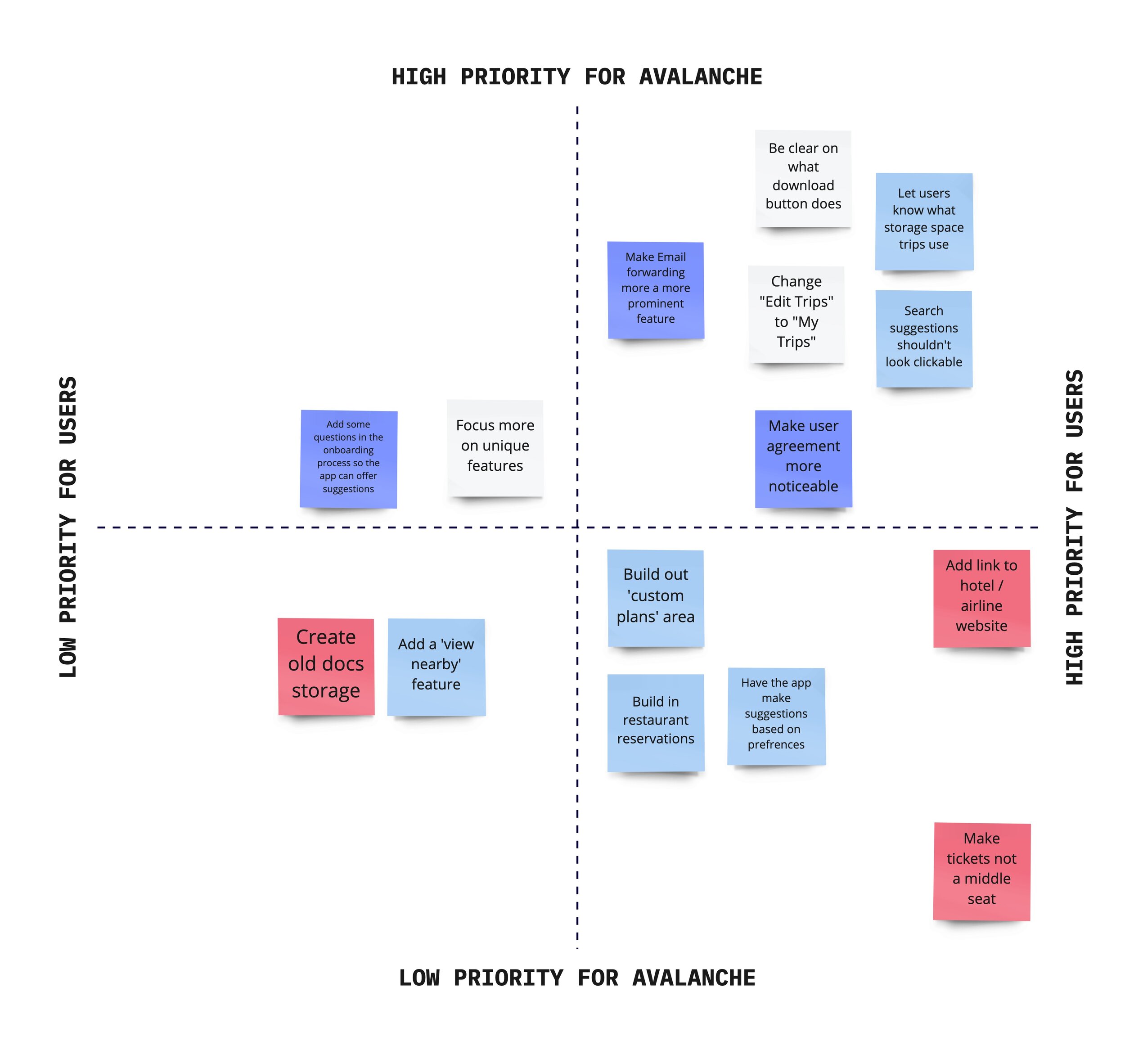
Key Learning From Tests
I organized my data from user tests I completed both in class and outside. I sorted these into five categories. My primary focus was on issues that needed to be addressed, but I included some positives, as well.
My biggest issue seemed to be that the features I created based on my research were not as prominent as they should be. I realized that when I did the paper prototypes I focused more on making a strong structure than fleshing out the features that were supposed to make the application unique.
Iterations Based on Testing
Two things I focused on change based on these tests as well as some feedback I got from presenting this project in class were:
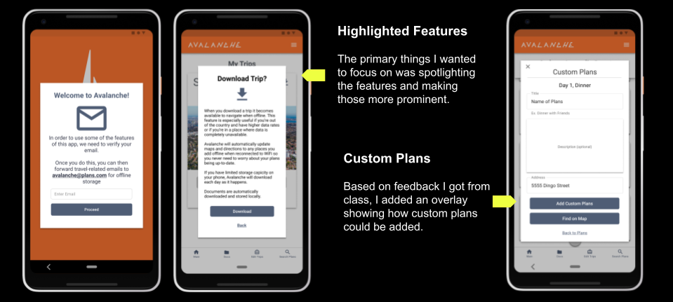
Highlight Features - As I stated earlier, I wanted to make sure the key features like email forwarding and the ability to download a trip were way more in the forefront.
Custom Plans - Something that I didn’t really flesh out in the mid-fidelity prototype was the custom plans feature. I wanted users to add plans for things that aren’t necessarily landmarks or restaurants. If a user wanted to add a plan to visit a friend they could do that.
Revisions From Testing
High Fidelity Prototype
In addition to the improved focus on the features, I added some color and images to the prototype to really complete the experience.
From a functional perspective, I tried making my buttons a bit larger; I increased the height of all of them from 39 to 44 pixels.
This was my first time working with Figma so I tried to dig into all the possibilities the program offers. A few of the animations I created made it into my newest versions (some of them really didn’t work how I wanted).
Overall, there was more that I considered adding, but, in order to avoid scope creep, I held off on some of my improvement ideas. For instance, I wanted to have the ability to build more of a profile, but I decided to hold off and maybe revisit that later.
High Fidelity Testing & Iterating
I did one more test with the more developed version of the app and found more areas I could improve upon moving forward.
Branding might be too similar to Kayak (whoops)
Could add filters to search page “Shopping, Restaurants, Landmarks, etc.” and remove them as suggestions
Usability Test Transcript Selections:
“I would probably want to see more photos so I would be swiping here.”
“As a user, I’m not sure I’d understand what this would be.”

PHASE 6: Conclusion + Future Opportunities
This was my first UX project and I found that the research and testing were the hardest parts for me to really enjoy. I felt like I did a good job actually working on those steps, but, overall, I think I enjoyed designing more. The biggest downside of this is that I think my design ended up being a little too open-ended in how it was designed. I think I could have made a better app with more focused design features if I would have done a better job asking questions and testing users. Overall, however, I'm really happy with this first UX Design Project.
Future Opportunites
Some things I should go back and improve upon in the future:
Add color to map
Custom plans need more explaining
Download plans might need less explaining
Thank You for Reading!
More Case Studies

FOREST SERVICE
Website UI Redesign

SHËL
Skincare Routine Builder