FOREST SERVICE - Website UI Redesign
UX/UI Design Project Case Study

Overview
This was a spec project for the U of M UX/UI Bootcamp. The task was to update a government website with improved information architecture and aesthetics. The United States Department of Agriculture’s Forest Service website was the site we chose as we felt it was badly in need of an update.
Problem
The USDA Forest Service website appears outdated, works poorly, and has confusing navigation. Its unattractive color scheme is inconsistent and fails to highlight the great nature photography available on the USDA FS Flickr site.
Solution
Conduct comprehensive usability tests on the current website to thoroughly evaluate existing issues and shortcomings. Following this evaluation, utilize the collected data to effectively address identified pain points, ultimately leading to the design of a better website that features improved navigation, enhanced layout, and more appealing visual design elements.
(Note: the official site has been updated since; it’s still not great in my opinion, but it’s an improvement over the site they were using previously. The website pictured below was used until the Spring of 2021)
Tools Used
Figma
Miro
Illustrator
Photoshop
Google Office
Role
UX Researcher
UX Designer
UI Designer
Timeline
One week of heuristic analysis and usability testing
One week of navigation redesign
Two weeks of prototyping and visual design

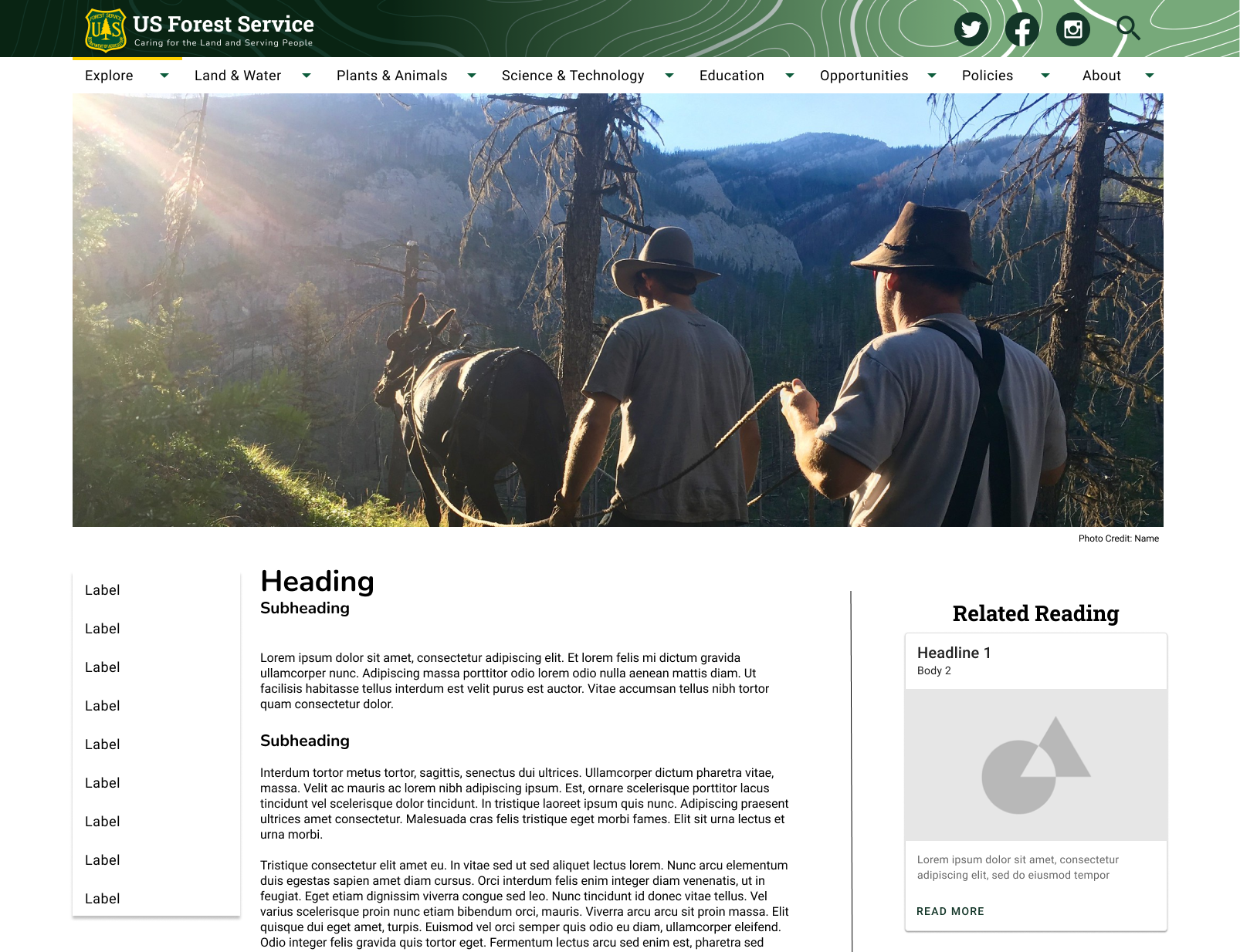
Actual Forest Service Website
This is what the site looked like when I started this project
PHASE 1: Research + Analysis
Heuristic Evaluation
It was important that we do break down the site and evaluate what works first. I concluded that there were quite a few glaring issues with the site as well as a variety of minor issues. These are some of the biggest problems:

Heuristic Evaluation of Forest Service website
The search bar didn’t work at all and was a slightly different shade of yellow than the ‘Go’ button that’s also on the page.
The visitor map had an outdated image of a phone.
The whole design packed a lot of different items in one area and has no whitespace.
There was a large image carousel as a hero image at the top of the page with another smaller image carousel right below making for a weird unbalanced and unfocused look.
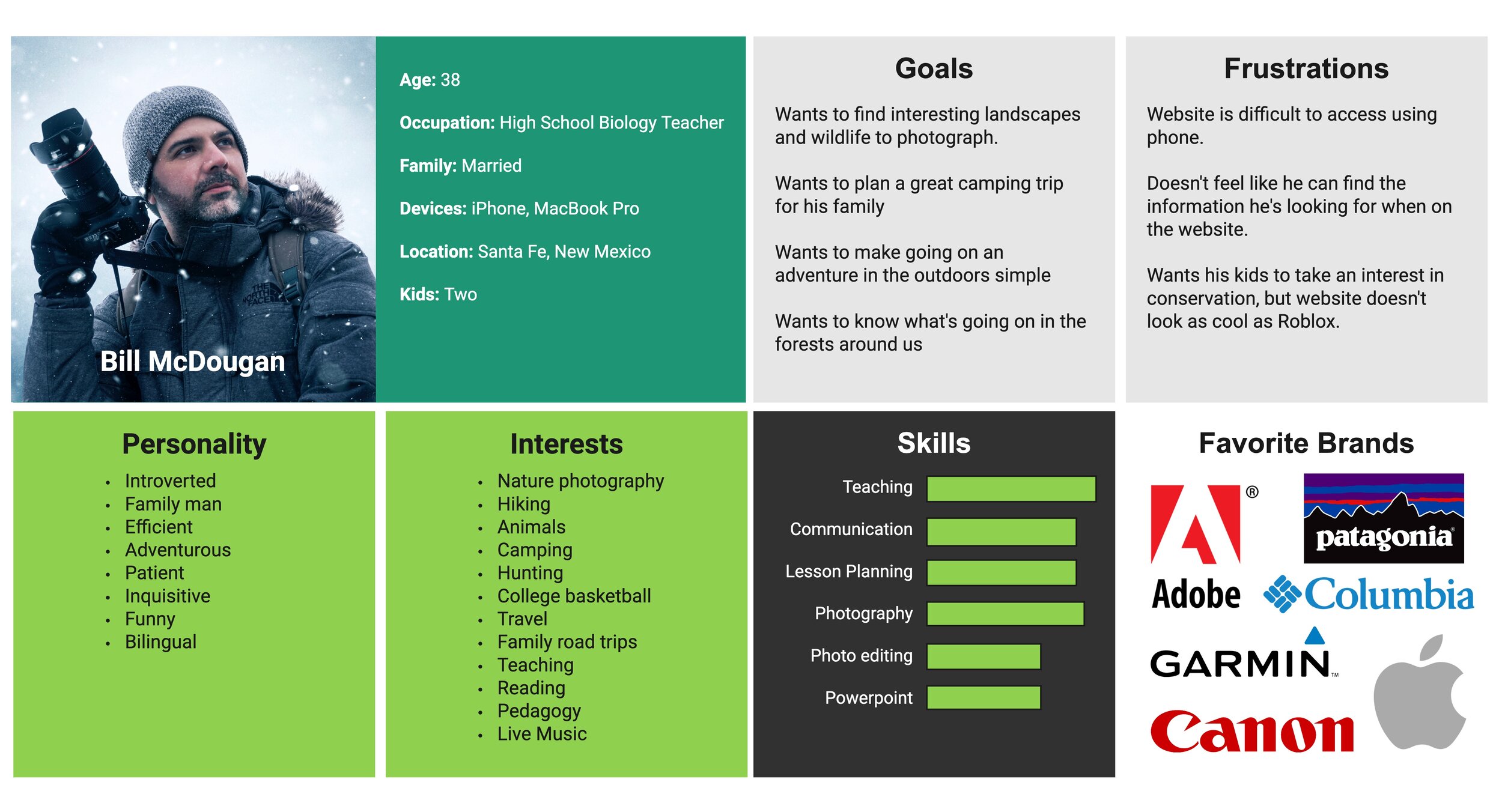
Proto Persona
Now that I had thoroughly examined the site, we could determine who we were designing this website for. I created a persona to help guide our design decisions. I decided that the person who would benefit the most from an improved Forest Service site would be a biology teacher with a family who has a passion for photography. I named this persona Bill McDougan.
Usability Testing
To determine the pain points of the Forest Service site, I conducted five usability tests by asking users to complete five different tasks. I analyzed these findings and found that users were only able to complete 54% of the tasks on average. These are some of the tasks I asked our users to complete and how successful they were:
Find a campsite in New Mexico and see what is nearby (10% success)
Find relevant articles related to the campsite (40% success)
Find job listings (80% success)
Usability Testing Notes
Some other issues I noticed during this usability testing process:
The United States Department of Agriculture logo at the top of the website links to the USDA’s main page so users would frequently navigate to a completely different website when they intended to simply return to the USDA’s main page.
The users we tested were not able to find the ‘Featured Stories’ section. This link was hidden below a news feed on the main page.
We noticed there was some inconsistency with the ‘Find a Forest or Grassland’ card on the main screen and the ‘Visit Destinations’ page. The former allows users to filter by state and then select the area they want from a list while the latter will sort by forest and then select an activity to do there. Both of these return the same results.
The plants in the Plant of the Week section were sorted by scientific name so blue oak is would be found under Q since its technical name is Quercus douglasii.
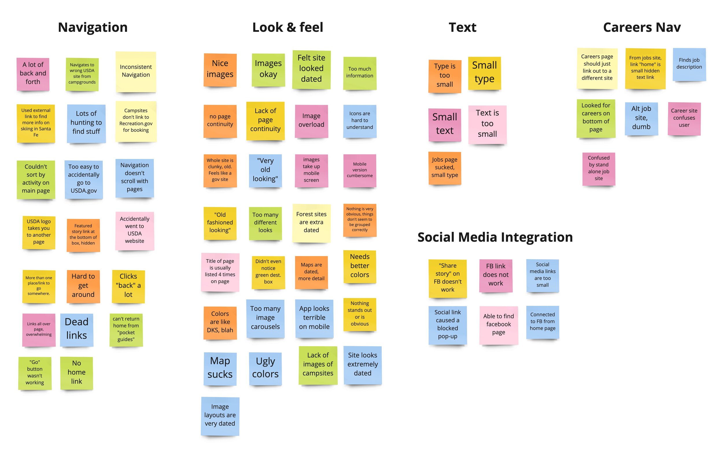
Affinity Diagram
We collected all our findings in Miro so can get an overview of the data before sorting this all into an affinity diagram.


Feature Prioritization Matrix
Once I finally had a clear idea of our users’ pain points I was better able to identify where I needed to focus our efforts on this site’s overhaul.
Improvements to focus on:
Modernize the look and feel
Create a succinct color scheme
Simplify information architecture
Find a better way to display images
You can see the matrix I used to make these prioritization decisions:
Empathy Map
The final step of my comprehensive research and analysis was to return to the proto-persona and dedicate a substantial amount of time to establish a clear and detailed view of what they do, say, think, and feel on a daily basis. In addition to this, I also created an extensive list of some of their specific pains and challenges, as well as what they would potentially gain with the implementation of an improved website. This thorough examination aimed to ensure that all aspects were addressed effectively.

PHASE 2 - Information Architecture
Digital Cartography
A website, much like a bustling city or a well-structured building, requires a thoughtfully designed map to navigate its complexities. With a well-constructed website, you have the unique luxury of shifting elements around, making continual improvements over time, and reevaluating the strategic placement of pages and navigation items to enhance usability. One of the most glaring issues with the Forest Service website was its perplexing navigation system. This navigation seemed to have numerous items continually added over time, yet it was never fully rebuilt with an ideal user experience in mind, leading to frustration among users trying to find information.
My aim with the redesign was to streamline the categories, remove duplicates, and reorganize the pages in an intuitive way with a better more straightforward sitemap.


Navigation Evaluation
Evaluating and documenting the pain points of the Forest Service’s navigation was an especially daunting task. I did my best to document all the issues we found in both the desktop and mobile versions of the website.
Navigation Usability Testing
As always, the user is the focus of all our efforts so the next task was to do more testing. For this, I decided to ask users to find three different pages to really see if they had any trouble traversing the website. Some of these links were actually impossible to find on mobile so our results looked even worse.
Navigation Testing Tasks
Find Minerals & Geology Management - 0% Success
Find how to apply for grants through the Forest Service - 100% Success
Find ‘Groundwater’ page - 0% Success
33% Success Rate
Card Sorting
In total there were 108 navigation items. Upon closer inspection, several of these turned out to be dead links or duplicates. I made sure to indicate whether a page’s nav item was in the header or footer even though this didn’t necessarily mean it would stay there in our new revised version of the sitemap.
Card Sorting Continued
Below you can see the new structure we decided on for the new navigation. There would be several iterations on this, but, as a starting point, this made the most sense.
Sitemap
From here, I built a sitemap based on results from the card sorting. As I mentioned before, the Forest Service site is absolutely massive. This was my first time tackling a website’s information architecture and it definitely feels like I jumped in the deep end of the pool.
Eight primary navigation items for the main header are just too many. If I did this again, I think I would try to find a better way to create Categories for these to live in.
Primary Page Changes:
Change ‘Visit Us’ to ‘Explore’
Changed ‘Learn’ to ‘Education’
Changed ‘Working with Us’ to ‘Opportunities’
Changed ‘About the Agency’ to just ‘About’
Created a category for policies
Created a category for ‘Land & Water’ and ‘Plants & Animals’
Navigation Prototype
With this plan in place, I was able to construct the navigation. Using Figma I built out a series of overlays to simulate a navigation bar. Below you can see a gif of an early version of the prototype. Hovering over various menus to display.

Mobile Navigation

Mobile footer

PHASE 3: Responsive Design
Big Improvements for Any Size Screen
Creating a new layout for the page content was the next big task. We felt it was best to just re-organize the content that was already on the homepage but just really improve the way it’s organized. Our desktop wireframe would be larger than the original and give the content a lot more whitespace. We added a big hero image at the top that spans the entire screen above the fold. Following the hero, I created a search bar for users to find a forest. I added a large card to showcase the map. After that, I spotlighted the Photos & Multimedia, History, and Science & Tech sections. I liked how the Forest Service site showcased the agency's employees so I added a Faces of The Forest Service section. Finally, right before the footer, I created four cards to spotlight the latest news headlines.
5 Second Tests
I conducted five ‘5 Second’ tests to just get a better idea of what user’s first impressions of the site would be. My biggest issue was that the hero was far too big and the people testing the site didn’t really realize that they could scroll down all the way to the footer. One user questioned if the text in the navigation menu was too large and felt that the plain white navbar display could be improved if it was slightly transparent.
PHASE: 4 Interaction Design
The Look and Feel
I was really eager to pull together a bunch of pictures, graphic patterns, and fonts to give the site a big makeover. I really limited the color palette to keep it very focused while putting a bigger emphasis on all the great pictures I found on the Forest Service’s Flicker page.
Style Tile
The style tile was a great way to throw my design ideas all in one place. I was able to plan out everything from the logos in different states, icons, and buttons in addition to the colors, images, and graphic patterns.
Typography
I chose the bold serif Roboto Slab as the primary type for large headers and Nunito for headings of less importance. Roboto Slab reminded me of the large signs you might see to welcome you to a state park or national forest. The rounded terminals on the letters reminded me of the brown signs with yellow type carved in I would see in places like Itasca State Park.
Visual Redesign
It was really nice to finally start applying a fresh coat of paint to the wireframes and seeing how much better it looked. You can see a number of example screens that feature a lot more white space which helps emphasize the images a lot more.
Desktop Redesign Examples


Mobile Redesign Examples
It was important to capture the same feeling as the desktop home page in the mobile version, though it did make the page really long. I would like to explore how to make sure these pages don’t require quite so much scrolling. I think a good way to overcome this would be to use areas the collapse as you scroll through.
Not sure how practical the page headings over the images would be, but I really like the look. The green gradient behind the text helps legibility quite a bit.


High Fidelity Testing
Now that I had a functioning high fidelity prototype I set out to test out the usability and verify my design choices. I needed to see if the site would work for people like Bill McDougan or anyone else who would need to navigate the website. I created a series of tasks to test users and locate pain points in the pages design. I also wanted to feel out any issues the users might have with the layout or visual components.
Task 1 - Can users find the 'Report Fraud on USDA contracts' in footer?
Task 2 - Can the users find 'Sustainability' in the nav menu?
Task 3 - Can the user navigate to 'The Newsroom'?
Task 4 - Can the users find 'Tribal Relations' in the nav menu?
I tested seven total users and achieved a success rate of 72.5%. While not optimized results, it was an improvement from my tests of the previous site. I decided to several revisions based on these results.
Iterations based on hifi testing
Iterations based on Hifi testing
Iterations Based on Testing
As you can see in the images above, I made several changes based on the tests.
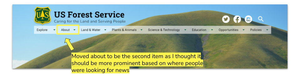
I moved the Sustainability page from Science & Technology to Land & Water
I moved Tribal Relations to the tab Policies
Working Figma Prototype

Phase 5: Conclusion + Future Opportunities
Conclusion
I definitely created an improved version of this site through this process. I was initially a little defensive when I got some criticisms of my wireframe designs, but those notes did the most to improve my final product. I should continue to test the navigation and make sure that more items are easy to find. The information architecture on this site will always be a daunting task as there are many nav items, but I think it’s going in the right direction for sure.
Next Steps
I would like to do more testing and hopefully speak with people who might be more critical of my visual designs. One helpful insight I had was that they would prefer if the content was presented in a way that would allow people to easily find what they might have navigated to the site to see. I’d like to figure out how I could better curate the content on the homepage to make it inviting.
Thank you for reading!
More Case Studies
SHËL
Skincare Routine Builder

AVALANCHE
Mobile Travel Application