SHËL - Skincare Routine Builder
UX/UI Design Project Case Study

Overview
Maintaining an effective skincare routine while avoiding hazardous ingredients can be challenging. Shël enables users to build skincare routines, check ingredients, read reviews, and connect with other product users to make clear and radiant skin as accessible as possible.
This was a three-person group project. My partners Parinaz Kassemi and Rachel Purtell. Believe it or not, the idea to do an app focused on women’s beauty products was mostly their idea. I definitely learned a lot about skincare while doing this project.
Problem
It can be difficult to maintain an effective skincare routine while avoiding ingredients that may be a problem for certain types of skin.
Solution
A skincare routine building app that allows users to find ingredients and read other user’s reviews to find the best products and use them successfully.
Tools Used
Figma
Miro
Illustrator
Photoshop
Google Docs
Role
UX Researcher
UX Designer
UI Designer
Timeline
Two weeks of research and ideation
One week of prototype design
One week of visual design
PHASE 1: Research
Proto Persona
We started with a proto persona of a woman having trouble maintaining a skincare routine while traveling. The stress of a busy job and the inability to verify what she needs when buying products in different cities had caused her to break out and feel terrible.
User Interviews
From here we interviewed seven different people about their skincare routines. This was all very new to me. I learned a lot by asking people about their routines and what products they prefer. A lot of my initial ideas were thrown out after this process. It was a really valuable lesson in making assumptions before making a project.
Research Question:
How could a mobile app assist in helping users learn more about skincare products and maintain a healthy skincare routine?
Research Objectives:
Discover more about what users know about skin types and how to take care of their specific skin type.
Find how people research their skincare products and make sure they will work for their needs.
Learn more about people's skincare routines and see if there are any patterns.
Sample Questions:
“How do you research products? - How many minutes/hours do you put into research before purchase?”
“Do you set a beauty budget for yourself?”
“Do you notice if your lifestyle affects your skin? -working out, alcohol, stress, living in a city, etc.”
Interview Transcript Selection:
“Something I’d really like to see in a skincare app is the capability to see which kind of products would work during what time of day and how I could organize that.”
User Data Analysis
Once we finished seven interviews we assorted our data as stick notes in Miro. What with the Pandemic going on we weren’t able to do any of this project in person, unfortunately. Once we had all our insights in one place we sorted those findings into an affinity diagram that gave us a better idea of what our user’s concerns were. The categories we created included budget, insights on user’s views of ingredients, thoughts on a theoretical skincare app, and skincare concerns.
Empathy Map
Now that we had an overview of what our user looks like we were able to create an empathy map. This would give us a clearer idea of the user we were designing for and let us better understand how to meet their needs when designing our app. Through the interview process, I learned how personal skincare can be so it was really pivotal that we have a very real person in mind that we could envision using this application.

Image by Drew Graham: https://unsplash.com/@dizzyd718
PHASE 2: Definition
What does Molly need and how can we help?
User Insight
Molly is a junior art director at a museum who lives a busy life. Her work requires her to travel often which leads to fluctuations in her routine. The results of her inconsistent lifestyle are beginning to have a negative impact on her skin.
Problem Statement
Using the 4 Ws: “ Molly, a young professional and skincare enthusiast, has the problem that travel and the stress of her busy career interfere with her pursuit of clear skin. She strives to develop better habits and seeks assistance in finding what would work best for her when she doesn't have the time to do more in-depth analysis and can't stick to an effective routine due to work and travel. Our solution should deliver personalized recommendations and direction for building a successful long-lasting routine with the most compatible products.”

PHASE 3: Ideation
“I Like, I Wish, What If” Method
Examples of things we Like:
Knowing what products work best for me
Understanding which products do/don't work well with each other
Getting recommendations based on price category
Example of things we Wish:
I wish I could remember to moisturize before I start looking like a crocodile
I wish I didn't have to spend so much time researching the best products for my skin
I wish I had more guidance on a helpful skincare routine when I was younger
Examples of ideas we had when we asked What if?
What if an app could help me build confidence
What if we could use lasers mounted to satellites to vanquish blemishes from space (no bad ideas!)
My phone could give me light healing therapy
Feature Prioritization Matrix
After we had a good assortment of ideas, we asked ourselves which of these Molly would view as the most useful and which we think would be the most achievable. Some of the focus features we wanted to create were:
The ability to read reviews
The ability to recommend products based on skin type
The ability to build and track your personal skincare routine
Ability to recommend products based on weather conditions
Storyboard
Now that we had an idea of the features we were going to try to implement we could start to consider how these would work for our user. We created a Storyboard to visualize exactly what value Shël could bring to a user.
PHASE 4: Prototype
Competitor Analysis
I specifically looked at an app called Think Dirty. It lets users scan barcodes to check ingredients and read reviews. We also looked at a routine building app called Fabulous as an indirect competitor. The Think Dirty app had probably the coolest feature; users can scan barcodes on items and get information about the ingredients as well as reviews from other users. Fabulous had the coolest-looking interface. I didn’t get too far into using Fabulous, but I loved all the illustrations. It definitely gor me thinking about how I could make Shël’s have a warm organic look and feel.

Fabulous
The illustrations in this app are absolutely gorgeous. They do a really good job of visualizing the journey of self-improvement.

Think Dirty
This is a coaching screen showing users how to scan products to get more information.
Strengths of competitor apps:
Think Dirty:
Excellent UI, great features, fun animations, lots of information to dig in and explore.
Picky:
Community of active "skincare lovers"
FeelinMySkin:
Keeps users coming back by doing "tip/term of the day"
Fabulous:
Great UI, plenty of pre-set habits already set, music plays along when the app opens
User Flow Diagram (First Version)
We were now capable of creating the user’s roadmap for this app. This would become the foundation on which we would build the Shël app. At this point, I had a pretty good idea of what we wanted to build for our users so I took the lead on building a User Flow. I used specific colors to indicate the main areas of the app: onboarding, routine, profile, and search.
Paper Wireframes
We each sketched out our ideas for the pages of the design of the app. We ended up using my sketches to build the paper prototype in InVision, but we made sure to include ideas from both Parinaz and Rachel’s wireframes.
There were some disagreements over the design, but we figured that testing would hopefully allow us to weed out some issues. We didn’t have a clear idea of the main screen at this point. I designed a sort of news feed layout with a bunch of tiles.


Paper Prototype
The first prototype had quite a few issues. Users could figure out how to search for products and add them to their drop list, but adding products to a routine wasn’t really clicking. Another major issue was people couldn’t figure out how to check off their routine. We decided the profile, main page, and routine were what we really needed to focus on. To get a better idea of how to improve on this for our mid-fidelity wireframes, we iterated on our user flow diagram.
User Flow Diagram (Second Version)
Based on the tests of the paper prototype, we decided it would be best to combine the routine and profile sections. This would make the app’s personalized features more centralized. Additionally, we determined the best configuration for the main page’s design would be a screen that lets you verify that you completed your routines. I imagine this would feature could also be completed with a phone notification as well since it might not be convenient to always open the app.
This new user flow made the goals of the user much more straightforward and allowed us to be more on the same page with the design of the app. We felt a lot better about making the digital wireframes than we did making the paper ones.
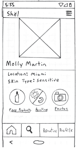
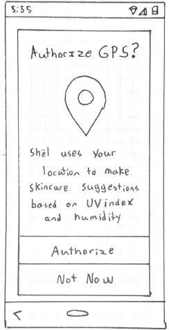
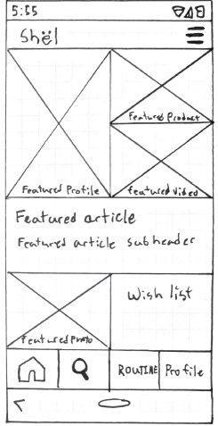
Digital Wireframes
After creating Avalanche I had a pretty good idea of how I could improve on my process of designing in Figma. I wanted to test a design that had a lot of organic curves and few straight lines. When we first opened the creation tool, Parinaz used a blob creation tool to make a big blob vector on the frame. I just went with that and tried to make every page have at least a few soft contours and an organic feel.


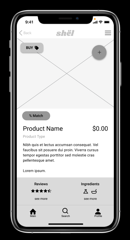

Mid-Fidelity Prototype
We had to complete this prototype on a pretty tight deadline due to the accelerated pace of the class. Parinaz worked on the presentation we would give in class while Rachel and myself drilled away on different aspects of the design. Rachel worked on a user assessment, product descriptions, and how the ingredients list and reviews would be displayed. I worked on the onboarding, the user profile, and the main page. As we worked we would through ideas at each and share ideas on how to build out this prototype.
Check out the working Figma prototype here:

Image by Anthony Tran: https://unsplash.com/@anthonytran
PHASE 5: User Testing + Outcomes
We now had a functional prototype we could test. Unfortunately, we were running out of time to test before presenting our design. I was able to complete a couple more tests.
User Goals for Testing
Here are some tasks we had users complete in the app
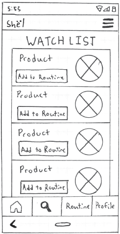
Add products to a watch list
Swap products out of a routine
Complete your routine for the day
Results
Some findings from our tests
Some buttons seem too small
The user’s routine might be better as stacked blocks instead of two columns.
The app could offer more guidance for setting up a routine.
PHASE 6: Conclusion + Future Opportunities
Conclusion
It was interesting to go through the design process as a group. We didn’t always agree on everything and it wasn’t always easy to move in the same direction together, but I think we did a pretty good job figuring it out. For the most part, it was nice to share the workload and figure out best how we can each contribute. I didn’t really expect to work on a skincare app, but I’m happy with the prototype we created. I think this was good practice for the real world where I won’t always be able to pick my team or the nature of the product I’m working on.
Changes and Future Opportunites
If I can find time, I’d like to make some changes to this app. Here’s a list of things I think should be updated.
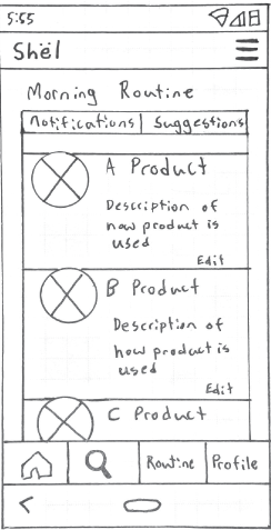
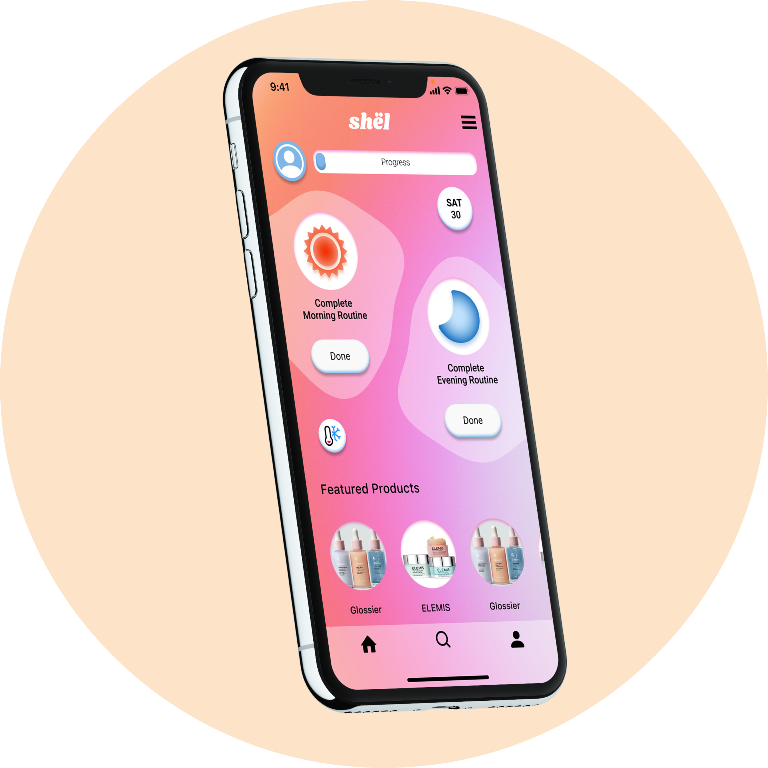
I started modifying some of the prototype screens with more high-fidelity visuals, color, and product images. I’d like to update the prototype to be full color. You can see a few of those screens in the images below.
I’d like to make the routine builder a little more straightforward I think it’s a little convoluted and I don’t think it’s a particularly good user experience at the moment.
Experiment with a stacked routine layout instead of the two columns. I think this would allow the user to have more space to view their routines.
I’d like to add more guidance to the routine building system. Testing showed that users found this part a little confusing.
Thank you for reading!
More Case Studies

FOREST SERVICE
Website UI Redesign
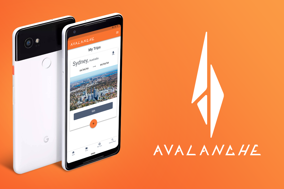
AVALANCHE
Mobile Travel Application