Solidified 3D - Case Study
It’s absolutely vital for a company to have a strong and recognizable logo. When designing a logo, it’s important to explore as many ideas as possible. It’s challenging and occasionally frustrating, but I know that, if I trust the process, eventually I can solve any problems that I encounter. In the following, I breakdown each step I took to create this design.
Alex and Casey decided to take their interest in 3D printing and turn it into a new business; they knew they needed a logo that could be recognizable and unique while still having some resemblance to other modern logos used by companies in the tech field. They decided to call this company Solidified 3D Printing and Design and I was asked to design the logo.
I started by researching the devices used in 3D printing. I also looked at what other 3D printing company logos were being used and identified what those designs were able to convey effectively. After I felt like I gathered enough information, I then brainstormed how these designs could tie together. I looked for the most recognizable components in 3D printers and how they could be simplified to their most basic shapes and then incorporated into designs. I tried to sketch as many designs as I could before moving on and creating vectorized versions. Finally, when I had two designs to work as a starting point, I moved into the concept development phase where I designed nearly a dozen different logos. I went back an forth via email with Alex and Casey working thorough revision process until I able to combine the best features of all their favorite designs I had developed until completion of the final logo.
Research
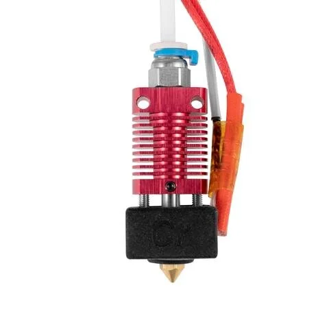
3D Printer Components
I had seen and used 3D printers on occasion, but I had never really studied the geometry of how they are designed. While looking at these parts I tried to distill them down to the most basic geometry.


3D Printer Company Logo Trends
To make sure my logo was unique but also followed similar trends to what was already out there I looked at some other logos for established 3D printing companies.


Brainstorm
I liked the triangle shape of the extruders and the metal ridges of the heatsink. I considered a suggestion by Alex who thought that the company name could look like it’s being printed via a nozzle. I liked the idea of having a simple logo with an “S” surrounded by some sort of shape, a hexagon was my first idea as it could look like the outline of a cube. I took these ideas and began to sketch.
Sketch
I don’t take a lot of time on each thumbnail. The details always seem to work themselves out when I start creating vectors into the computer. When sketching, I try to just connect as many of my ideas together as possible.
Concept Development
I took my best ideas from the sketches and created clean and balanced versions of the two that I thought would work the best.


Both of these initial designs actually looked pretty good rotated. I liked the hexagon logo rotated 30 degrees to the left and the triangle logo rotated 60 degrees to the left.


I continued to experiment with this “S” logo. I tried modifying and reworking the hexagon shape. I experimented with adding more of a simulated 3D look. You can see that I attempted to incorporate 3D into the company name by turning the “E” around so it looks like a “3”.


More of a simulated 3D look with a smoother logo.

Similar to the design before, but adapted so it could be used in black and white applications such as letterhead.
Revision
Alex and Casey liked the first design I had and we decided to refine that into a final logo. The “S” shape looked pretty good, but I felt it was too similar to other 3D printing company logos that were already out there. I tried to add more variation to the design to make it unique.

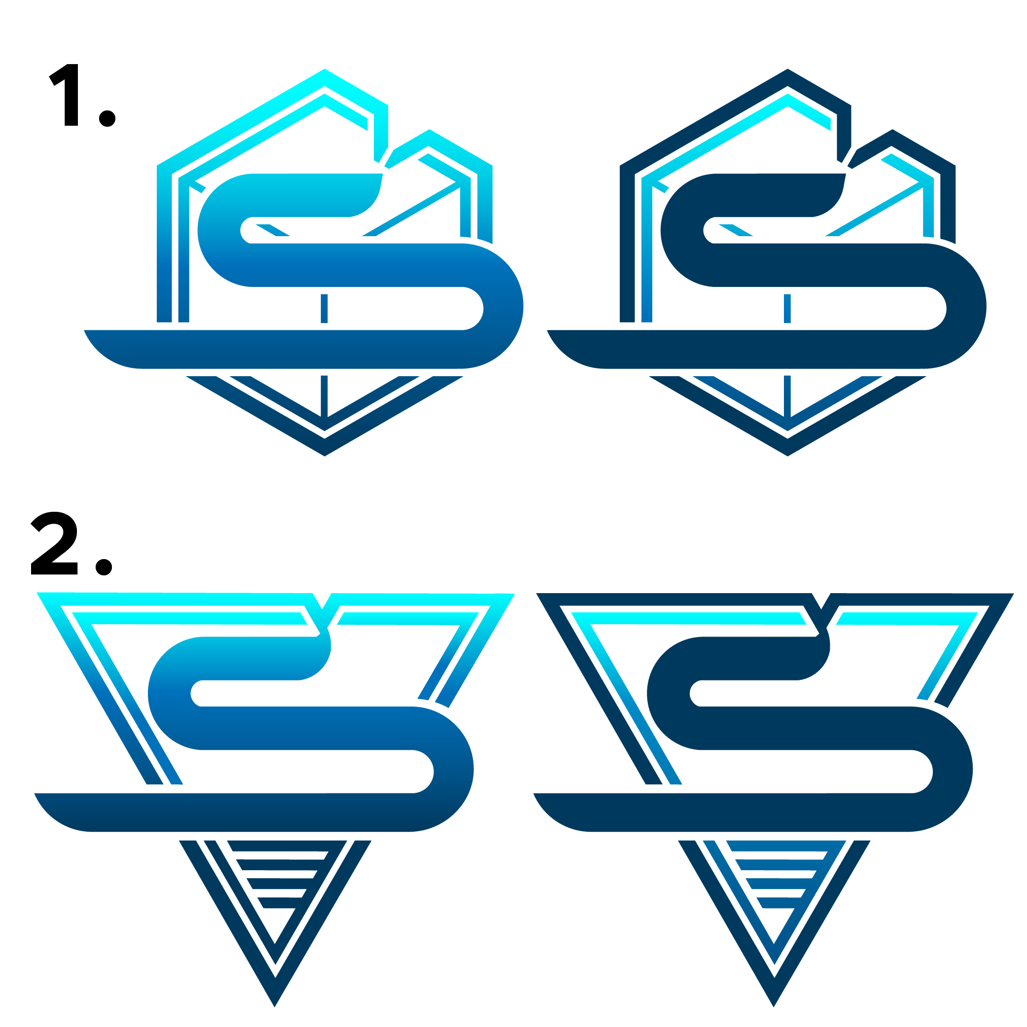
I took the same design and looked at other shapes that could be used as the frame for the “S”. I tried a circle and a triangle. I also tried different variations of the cube. The circle didn’t really work at all, but I ended up using some ideas from both 1 and 2 in the final design.

The best designs we decided on were either the Hexagon or the Triangle. In another revision, I tried adding more depth to the hexagon design with lines to simulate a 3D cube. I added short lines to the triangle design so it has those details that make it look like an extruder.

I went back to add the color and I realized that the gradient I was using before made the logo too bright. I modified the design so the logo had a gradient element framed within the rest of the logo.
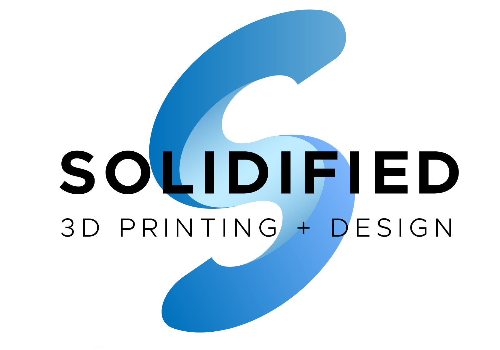
Project Completion
The triangle logo with the framed gradient design was the one we decided to go with. The final modification was to change the nozzle so there was a gap in the outer triangle frame and wasn’t connected to the “S”.
I created a version where the “S” insignia was used as the first letter in the company name with “3D Printing and Design” written below.
Conclusion: This has been a brief rundown of how I move through the creative process. From the first brief to the final logo, I try to be thorough and thoughtful at every step. It’s important to me that each small detail be considered and that the input of my clients is carefully considered.
BONUS:
Logo Animation
I created an animated version of the logo. My idea was that the three dots at the beginning represent the coordinates that are eventually used to print designs and objects. The “S” logo itself is extruded within the triangle frame and the rest of the Solidified quickly prints in. The E is backwards so it sort of looks like the ED is actually 3D, but then it flips when “3D Printing and Design” fades in.
